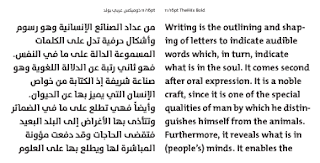
TheMix Arabic Bold - TheMix Arabic font has been designed by Lucas de Groot and Mouneer Al-Shaarani.
This project is a collaboration between the renown Dutch type designer, Lucas de Groot, and the renown Arab calligrapher and designer, Mouneer Al-Shaarani, and with technical support from Pascal Zoghbi.
The design concept.
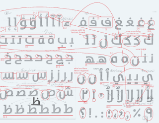
The idea of matching a western designer with an interest in mixing Latin styles with an Arab calligrapher with the same interest in mixing Arabic calligraphic styles, both proficient with lettering yet interested in more simplified contemporary design, seemed like the perfect solution at the time. This choice and team also fitted the idea of developing the Arabic version of the hybrid family member of the Thesis font family — TheMix. For me, TheMix embodied some of the subtle experimental approaches to type design ( specially indicative of the typographic design trends of the 90s). I always felt that kind of approach was also necessary for Arabic type design, especially knowing how easy it would be to develop such experiments with a script that is inherently rich with variety and flexibility. TheMix was also the best font to start with since it carried serifs on some letters and not others, and it had some cursive qualities and roman/ humanist proportions and strokes, though it is almost a monolinear sans serif. Both these latter qualities made it more easily compatible with the Arabic lettering tradition. It was also the best font to start from, since it is the one that would eventually be a nice match for both the serif and sans serif fonts of the Thesis family. And so the concept of a fresh and contemporary- looking Arabic typeface was born.
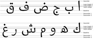
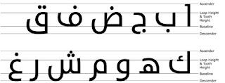
Looking below. The first set is SADA and the second is TheMixArab. Sada is based on the Naskh style while TheMixArab is based on the Kufi Style. Notice the guidelines in each typeface. Since Sada is based on the Naskh style, the letters are more flowing and they do not all have the same heights. In Sada there is two tooth heights, two loop heights, one ascender height and two descender heights. On the contrary, TheMixArab has one guideline used for loop height and tooth height, one descender and one ascender. Since the Kufi style is more geometric, TheMixArab does not need as much guidelines as Sada. The Naskh based typeface is more calligraphic then a Kufi based typeface and hence needs more guidelines to make all the letterforms harmonious. So depending on the Arabic typeface designed and the purpose of its design, the guidelines will be decided on by the type designer. There isn’t one rule that fits all Arabic typefaces as in the Latin typefaces. The guidelines in Arabic type designing replace both “Nizam Al Dairah” and “Nizam Al-Nuqat” in calligraphy. The third writing system “Nizam Al-Tashabuh” is replaced by components. Components in type designing are pen strokes that are used to create several letters. Examples of letters that use components are the same as the ones listed in “Nizam Al-Tashabuh” previously. In the Arabic alphabet there is 17 basic pen strokes that build up the whole alphabet.

No comments:
Post a Comment